📋 The Problem

Salesforce defaults, on top of a Carbon-based brand.

IBM's Partner Portal and Partner Plus were built on Salesforce — but Salesforce's default Lightning components didn't match the rest of IBM's Carbon-based digital experience, and usability issues couldn't be avoided with the out-of-the-box options either. A dedicated Carbon for Salesforce (C4S) design system team formed to solve this: build the foundational framework and tooling that let every product team in the Partner Ecosystem deliver an IBM-branded experience on Salesforce.

I was one of the designers on that team, not the sole owner of the library. My specific contribution was translating pages from Lightning to Carbon, and — where the translation surfaced a real gap — designing and building the new component in Figma myself, balancing what already existed against genuine new need before it went to the dedicated engineering team for development. I also contributed patterns to the library, including In-Page Navigation.

Role

  • Title: Senior Product Designer
  • Focus: Lightning-to-Carbon page translation; designing new components and patterns as gaps emerged
  • Team: One of several designers on the C4S design system team
  • Platform: Figma library, backed by a Salesforce LWC code repository
Carbon salesforce cover

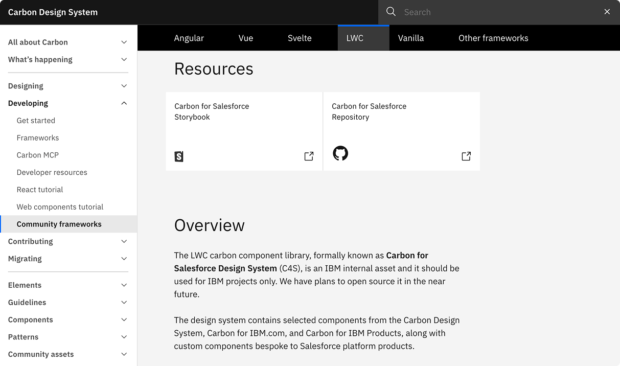
The library only contains what's genuinely bespoke to Salesforce — for anything already covered by the official Carbon Design System or Carbon for IBM.com libraries, it points designers there instead of duplicating it.

🧭 The System

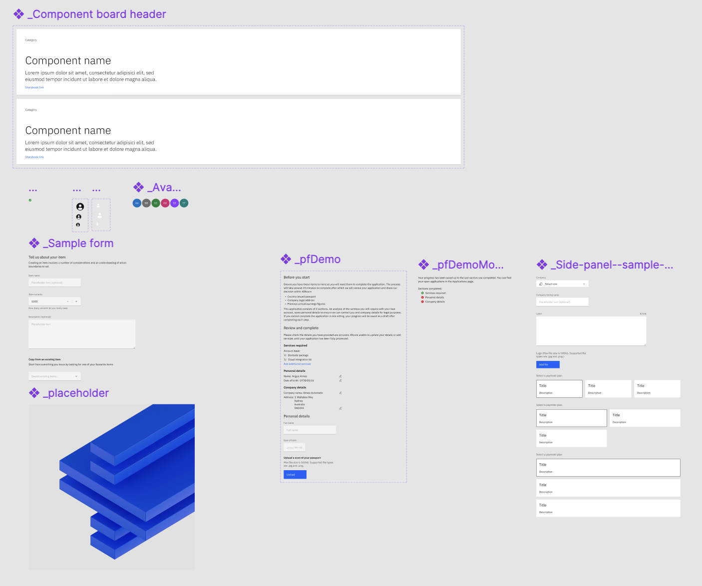
Carbon for Salesforce is a Salesforce LWC framework implementation of the Carbon Design System and ecosystem — the code repository contains components from Carbon Design System, Carbon for IBM.com, and custom components designed specifically for IBM Partner Portal and Partner Plus use cases. The Figma library stays deliberately narrow: it only carries the components bespoke to Carbon for Salesforce, and is offered in Gray10 theme only (with the exception of the UI shell), to fit the specific need of these two products rather than trying to be a general-purpose system.

28
Bespoke components in the Figma library alone
7
Documented patterns
Gray10
Theme, scoped to Partner Portal & Partner Plus needs
LWC
Backed by a Salesforce code repository, not Figma alone

The library spans everything from small primitives to full page-level scaffolding: avatars, cards, tags, and tooltips sit alongside structural components like the UI shell header, left panel, notifications, and product-specific pieces like the company switcher and PDF viewer.

Across the whole team, in the two years since C4S launched, this grew into a full extension of the Carbon Design System — the 28 bespoke components above are only the Partner-Ecosystem-specific slice of a much larger effort:

117
Components delivered across the whole team
23
Squads building with C4S components
1.4k
Weekly Figma component inserts
Carbon salesforce components

🔍 Patterns

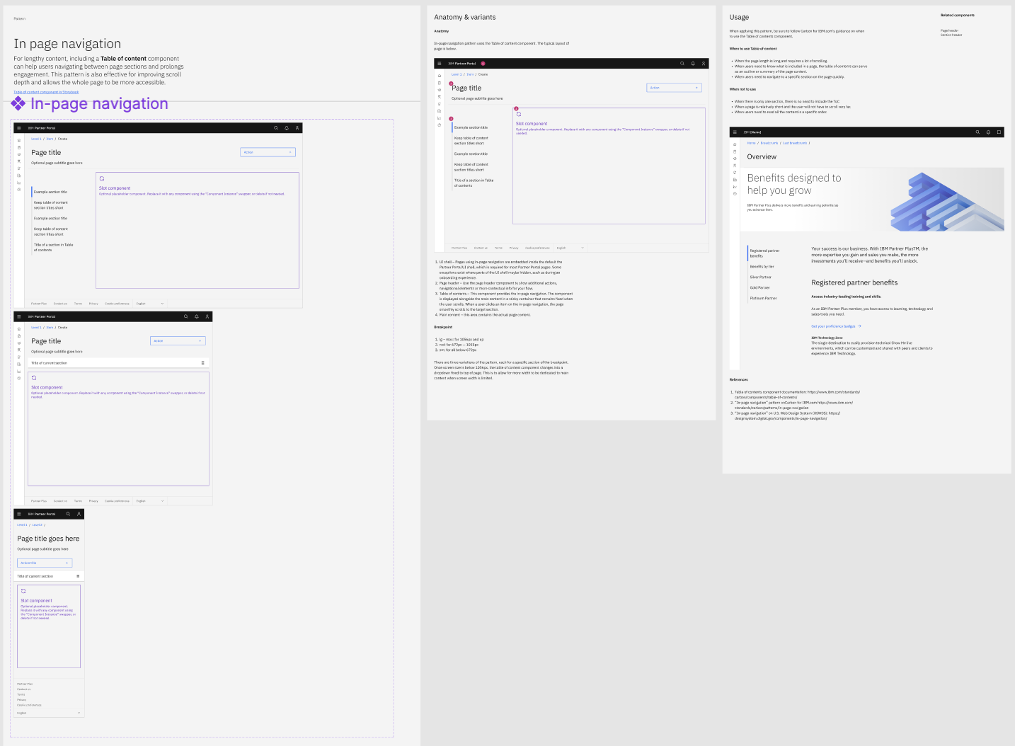
Beyond individual components, the library documents patterns — structural guidance for assembling components into a consistent flow. In-Page Navigation is one I contributed myself: a pattern for lengthy content, pairing a Table of Contents component with the page so users can navigate between sections without losing their place — it improves scroll depth and makes long pages more accessible.

01
Anatomy

UI shell & page header

Pages using in-page navigation are embedded inside the default Partner Portal UI shell — some exceptions exist where parts of the shell are hidden, such as during onboarding. The page header shows additional actions, navigational elements, or contextual info for the flow.

02
Anatomy

Table of Contents component

Displayed alongside the main content in a sticky container that stays fixed as the user scrolls. Clicking an item smoothly scrolls the page to that section, and the current section stays highlighted.

03
Anatomy

Main content & responsive breakpoints

The main content area holds the actual page content. Below the large breakpoint (1056px), the Table of Contents collapses into a dropdown fixed to the top of the page, freeing width for content on smaller screens.

04
Usage

When to use it — and when not to

Use it when a page is long enough to require real scrolling, when users need an outline of what's on the page, or when they need to jump to a specific section quickly. Skip it when a page has only one section, is short enough not to need much scrolling, or when users need to read everything in a fixed order.

Carbon salesforce pattern

🧩 Enterprise Challenges

Working at this scale meant solving problems specific to business-to-business operation, not just visual consistency:

01
Complexity

Making corporate process legible

Communicating complex certification processes, incentive programs, and eligibility requirements clearly, rather than leaving partners to decode them.

02
Data

Designing for messy, decades-old data

Improving data hygiene in large datasets collected over decades, against geo-political and data-privacy rules that keep changing underneath them.

03
Localisation

Consistency across language, time zone, and currency

Designing with one consistent system while still accommodating real differences from translation, time zones, and currency conversion.

04
Migration

Moving users off legacy platforms without disruption

Supporting and encouraging partners to migrate off legacy tools smoothly, without interrupting the business they were running on them.

🚀 Impact

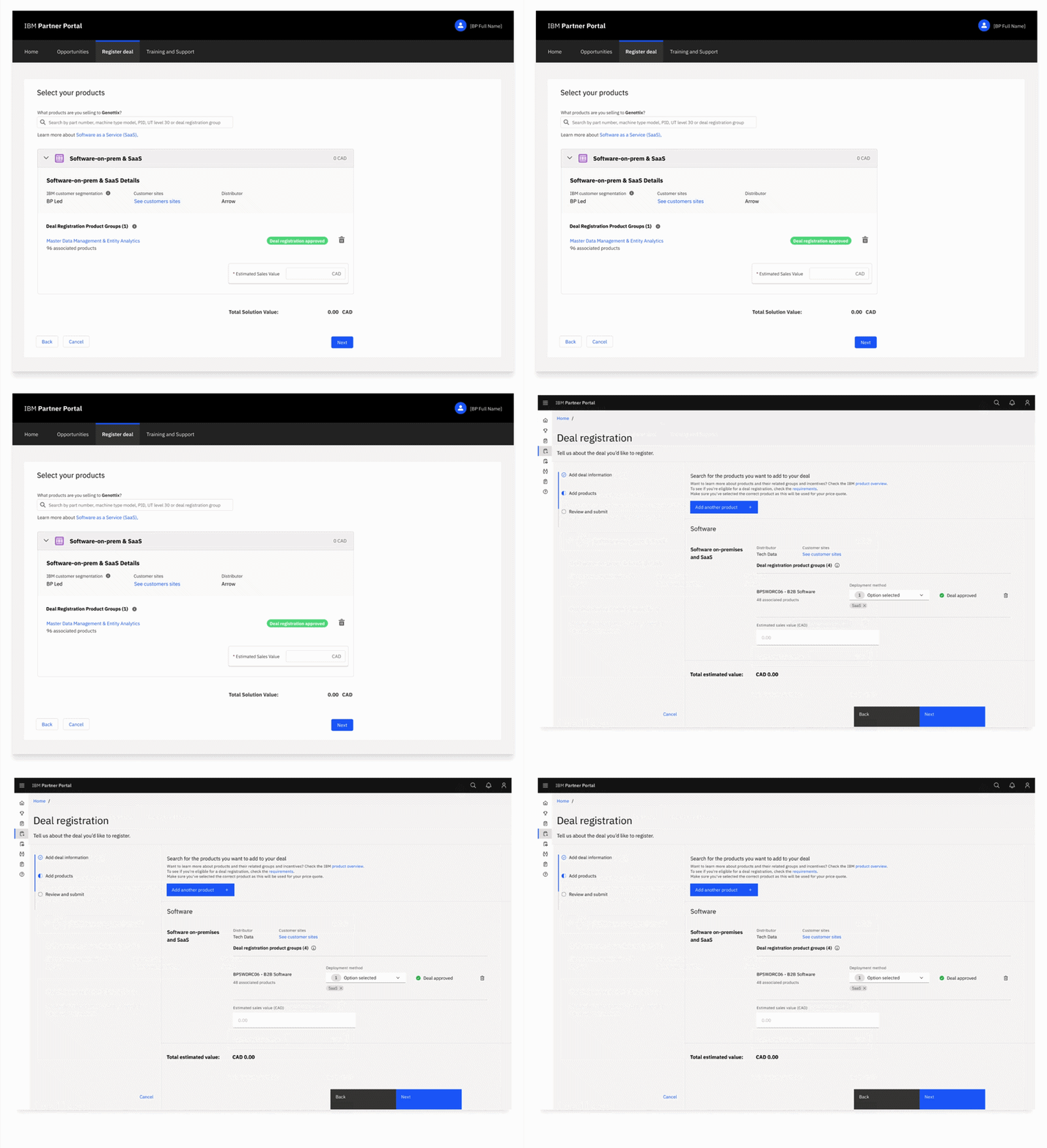
Carbon for Salesforce is the foundation the rest of my Partner Portal work builds on — the Deal Registration redesign was built on these components, and the User Flow Library I created separately exists specifically to help designers assemble Carbon-aligned wireframes from this system faster, for early-stage ERB review.

Partners told the team the experience was "much better than it used to be" — including specifically on deal registration. Feedback shared with the C4S team, from a Partner Portal user
Carbon salesforce pattern