📋 The Problem
25 clicks. Zero trust.
Deal Registration is how IBM partners protect a sale and unlock incentives — it's one of the core journeys inside the wider IBM Partner Portal, which itself unified 45 legacy apps into a single platform. Within that portal, Deal Registration was the single biggest source of friction: finalising one deal took 25 clicks, with no visibility into why deals were rejected and no trust in the data on either side.
Role
- Title: Senior Product Designer
- Focus: Global Partner Experience
- Scope: Deal Registration & System Unification
- Team: 10+ cross-functional squads
Partners were making 25 clicks just to finalise one deal, with no visibility into why it might be rejected.
🎯 Goal & Discovery
The goal was one platform, one command centre for all partner revenue activity — built around a single mission: partners need visibility into the system, sellers need to trust the data. I got there through blueprinting workshops mapping the flow end to end, then talking to partners and sellers directly. Four things stood out:
not decision
🧭 Approach & Solution
Three pillars drove every decision I made, built as one consistent system rather than a one-off flow:
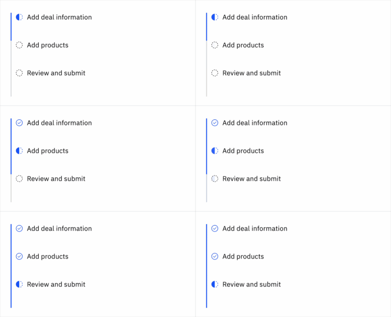
Simplify
I designed progressive disclosure so partners only see the complexity they need, when they need it
I restructured the flow to 3 steps, down from 4, and rewrote the dense legal language in context
Transparency
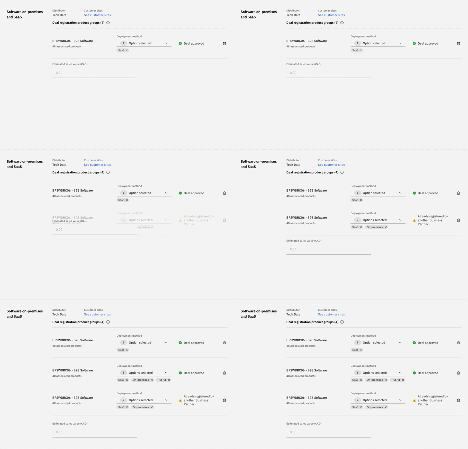
I designed inline eligibility feedback in real time, moving partners from "your deal was rejected" to "here's what you need to qualify"
The biggest single driver of trust improvement
Automate
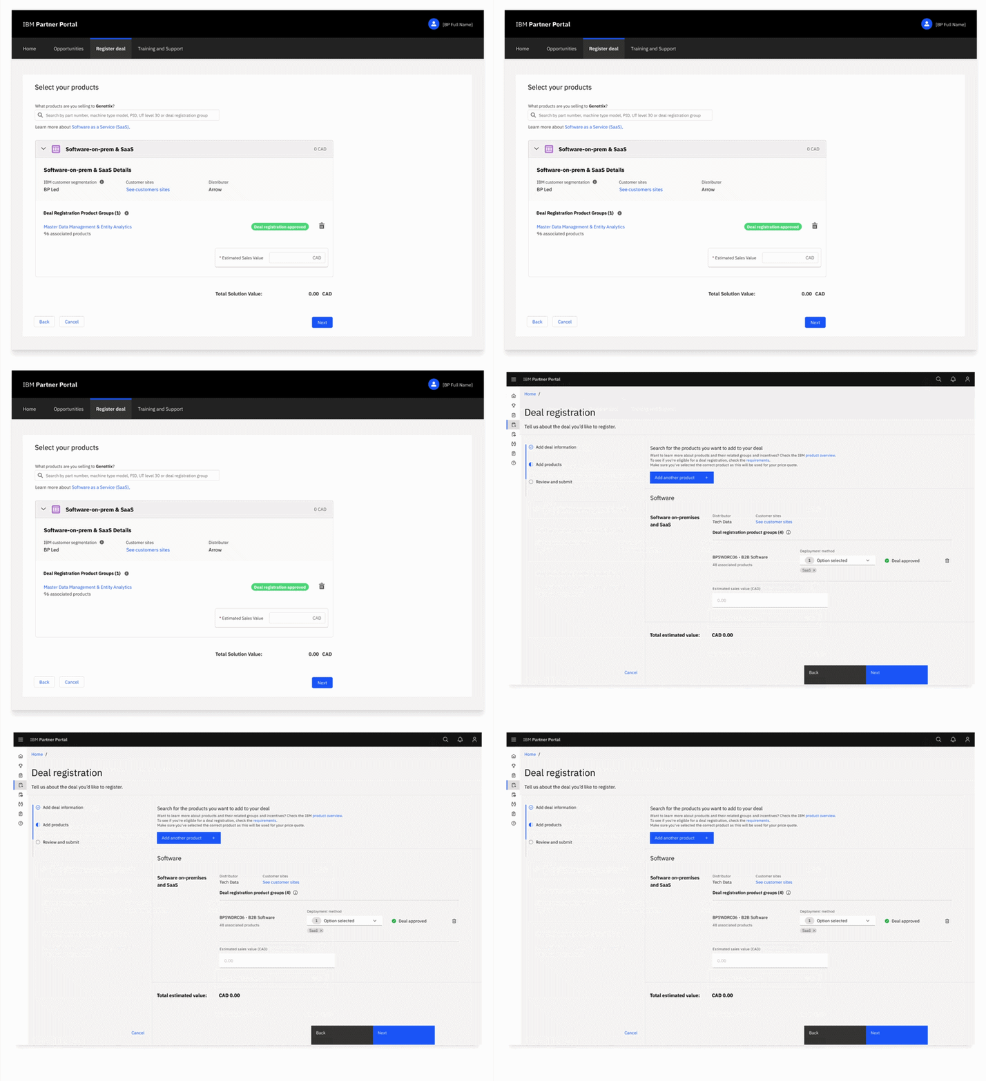
I built the components on the Carbon for Salesforce library
What made global deployment at scale possible
🌐 Rollout & Localisation
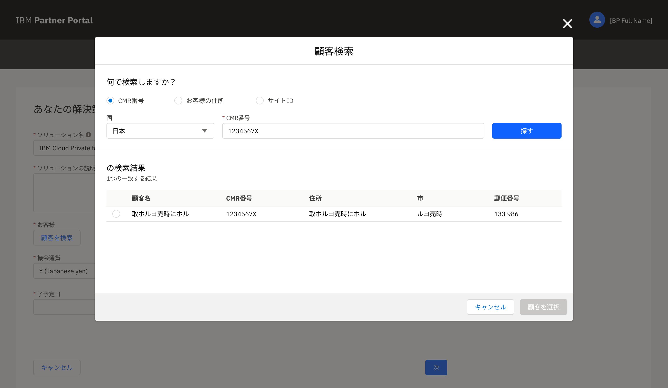
Each wave needed structural adaptation, not just translation: legal language per region, date and number formats affecting validation, and in Japan, dual-language address lookup (native Japanese and Romanised, simultaneously), which had to be a data-model decision, not a late-stage localisation fix.
Canada
MVP launch
Latin America & SSA
Regional compliance and legal language adaptation
Japan, Korea, ANZ, UK & Poland
Dual-language address data model, date/number format handling
Worldwide
Full global availability
⚖️ Constraints & Trade-offs
The MVP launched honest about what it couldn't do yet — the right outcome for an MVP. Three constraints shaped everything after.
Inconsistent UI
Shipped with Salesforce out-of-the-box components rather than rush a Carbon migration to hit the launch date — accepting a known gap in exchange for learning from real users faster.
Content debt
Labels were locked at MVP; tooltips patched the gaps. Content design now needs to be in the room from Sprint 0, not reviewed after the fact.
Siloed decisions
10+ squads across time zones were making calls in isolation. Fixed with structured end-to-end review sessions so the whole system stayed visible.
🔍 Validation
I went back to real partners to validate the redesign — deliberately not just the easy markets.
"Don't have to do it twice anymore." Partner feedback, on the combined registration flow
🔁 Iteration
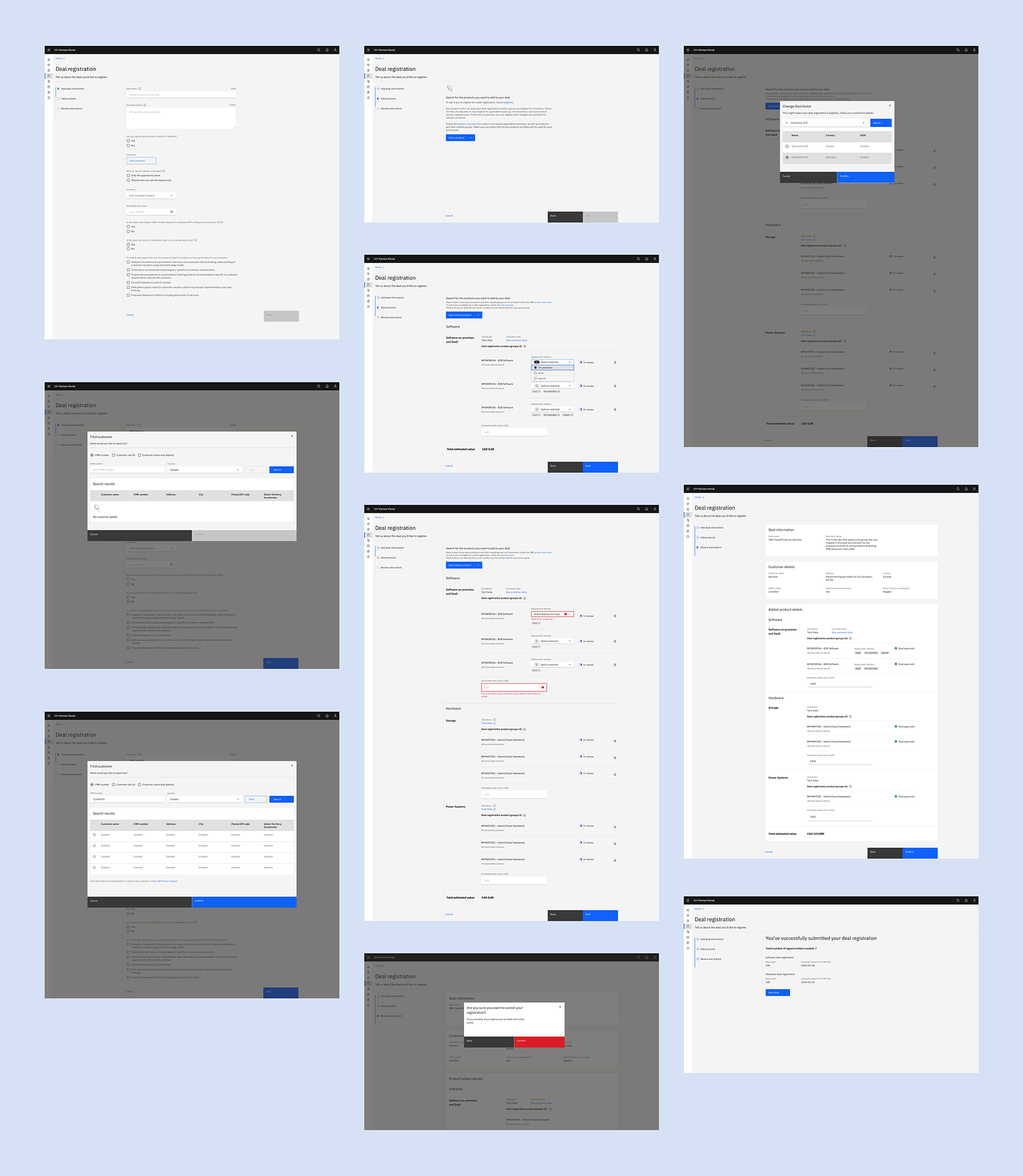
I shipped an MVP on Salesforce Lightning inside a Carbon shell to move fast, then used what I learned to carbonise the experience properly and unify components across the whole portal.
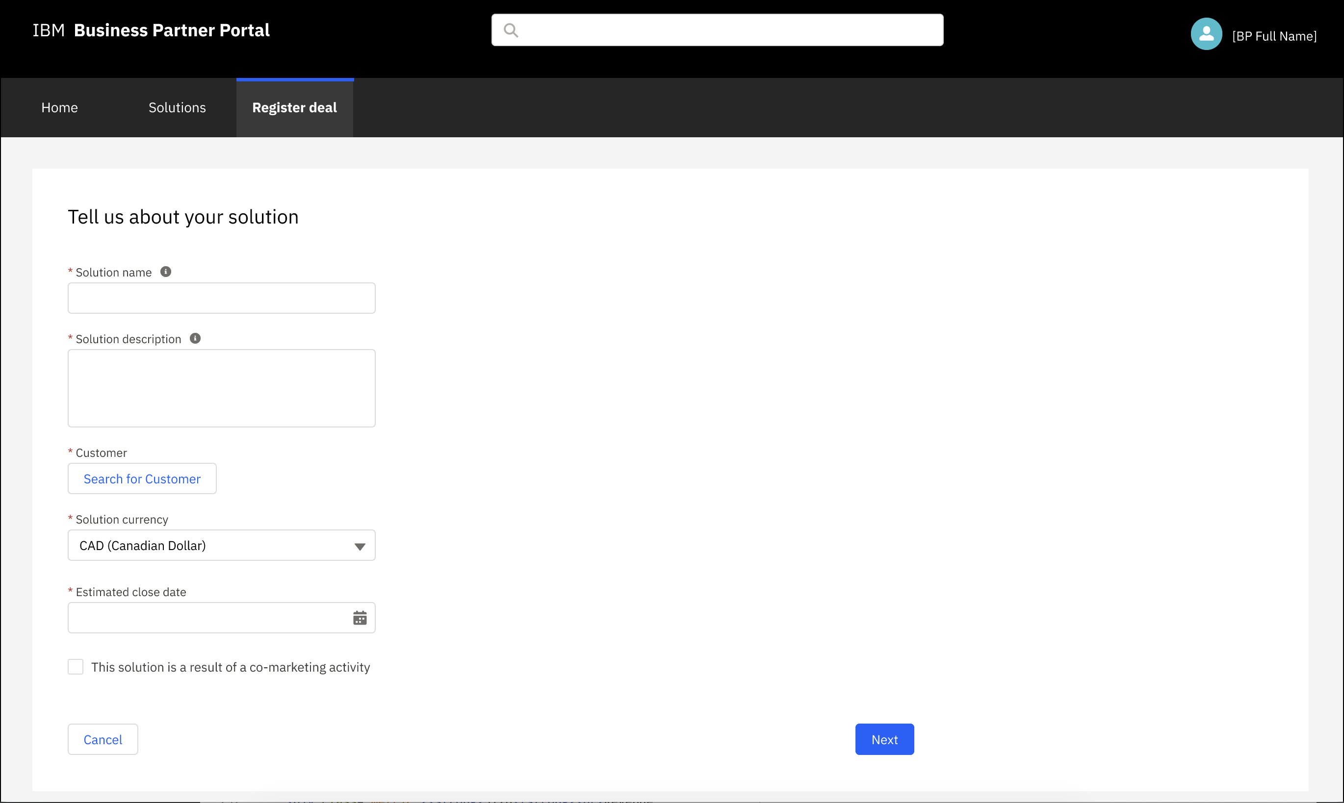
Before
- • 4-step flow, 25 clicks to finalise
- • Dense legal language
- • Multi-system touchpoints
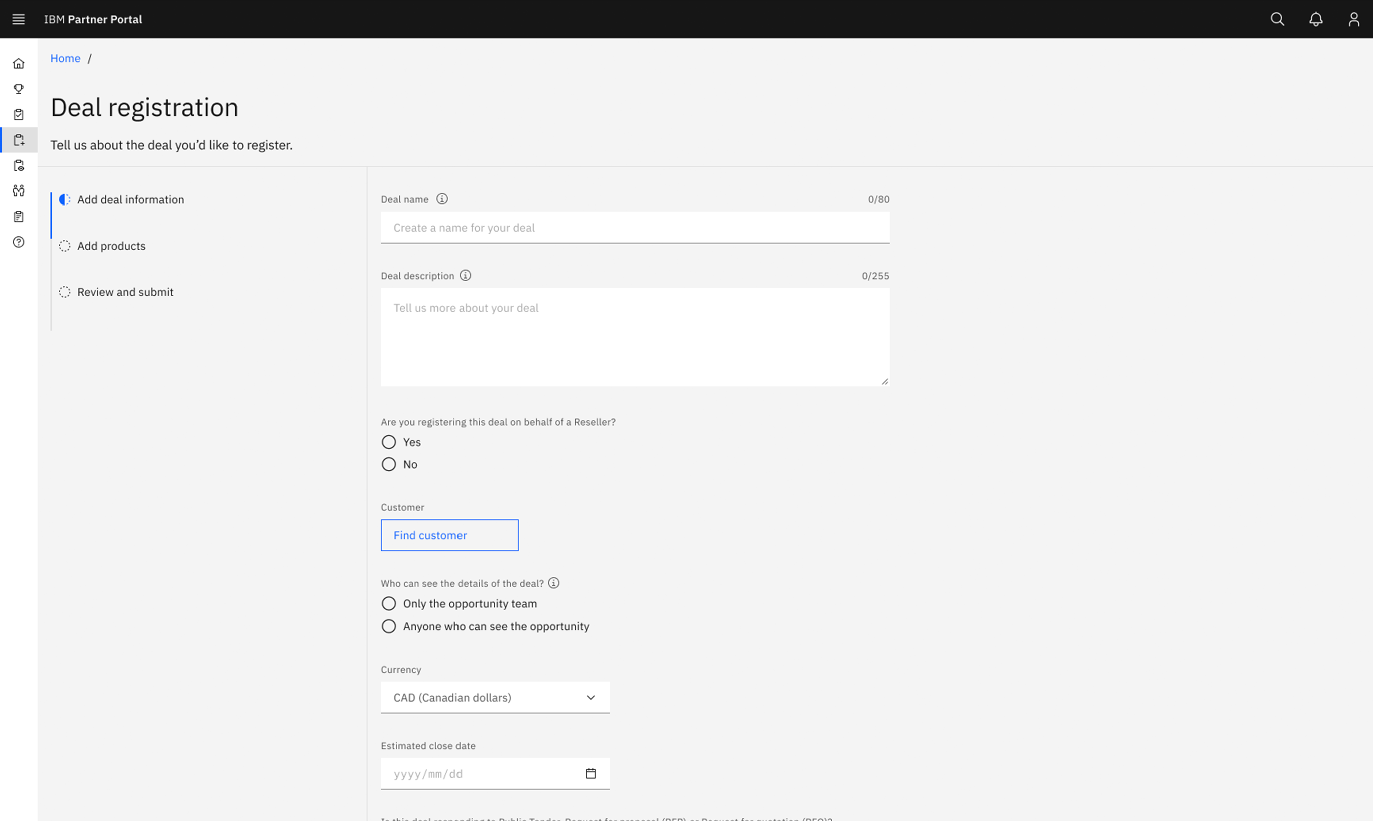
After
- • 3-step flow, 3 clicks to finalise
- • Progressive disclosure
- • One consistent system
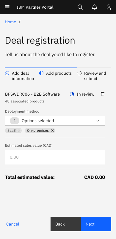
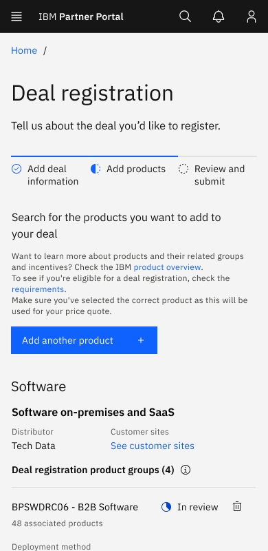
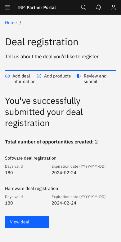
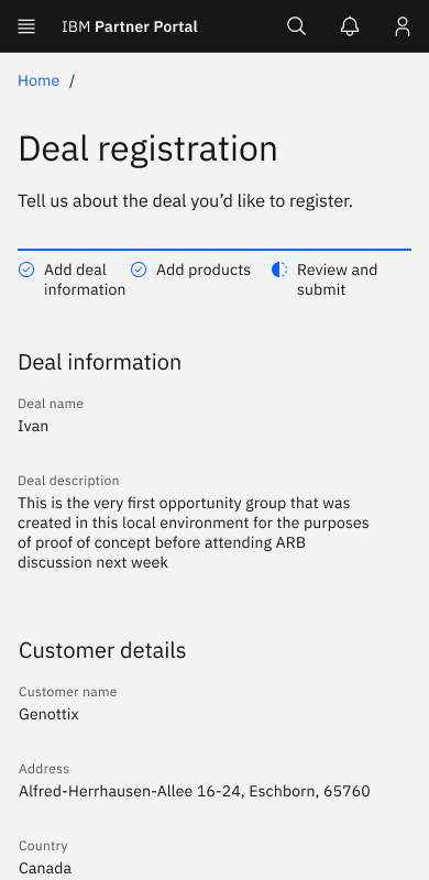
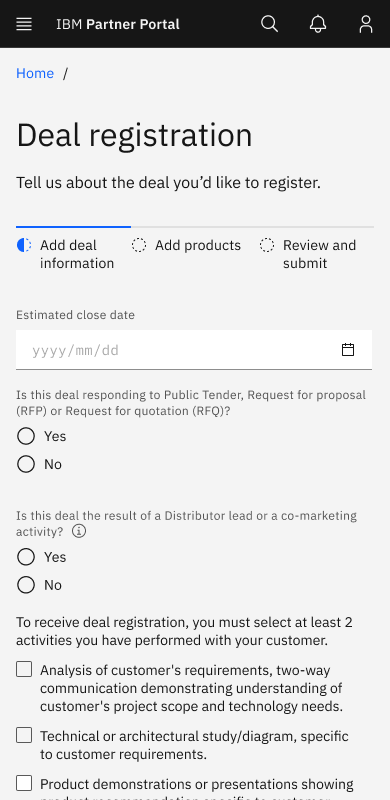
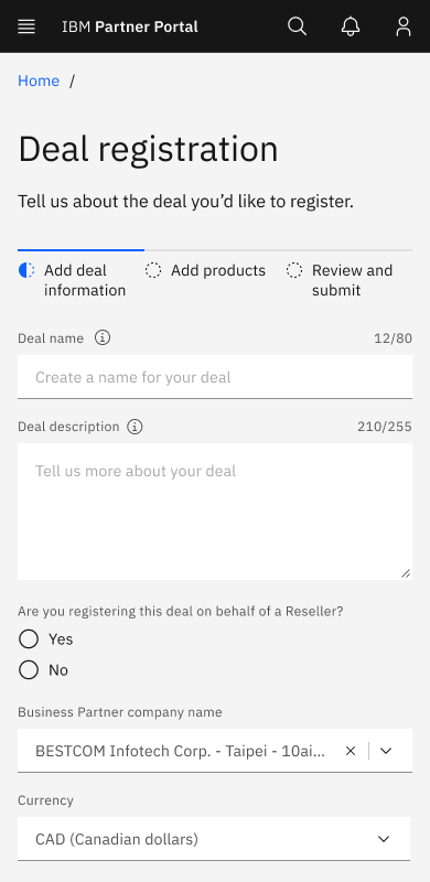
Billions in annual revenue now move through a deal that used to take 25 clicks. Now it takes 3.
📊 Results
Two separate metrics worth telling apart: the total click count to finalise an agreement dropped from 25 to 3 at first release; the flow itself went from 4 steps to 3 later, through iteration.
Deal Registration became the flagship journey inside a portal that unified 45 legacy apps into one system. This wasn't just a UX redesign, it was operational transformation at enterprise scale.
💡 Key Learnings & What I'd Do Differently
Three things I'd carry into the next project, learned directly from what didn't go smoothly here.
Content from Sprint 0
Working around locked labels with tooltips is a problem content design in the room from day one would have prevented.
Instrument earlier
I measured impact retrospectively here — next time I'd align on success metrics before opening Figma.
Design global from day one
Japan taught me cultural variation is a design-architecture decision, not a later localisation task.