📋 The Problem

One brand, six markets, no shared standard.

Avon's digital presence spanned websites and apps across multiple international markets, each built without a shared set of standards to work from. I led the creation of a global design system — a collection of reusable components with clear standards to help build and improve Avon websites and apps worldwide, coordinating three engineering teams across six markets as Global Lead UI Designer.

Role

  • Title: Global Lead UI Designer
  • Client: Avon
  • Scope: Web, iOS, and Android design system
  • Tools: Sketch, Zeplin

This is the core for consistency: identity elements, principles, best practices, components, and patterns, in one living style guide.

🎨 Foundations

The system was built to work across web and native apps, with grid, colour, and type specs defined precisely enough that any designer or engineer could pick it up without guesswork.

Grid

01
Desktop

12-column grid

1440px width grid, 1800px max width, 80px columns, 40px gutters, 20px padding.

02
Mobile — iOS

6-column grid, 345px width

15px offset, 50px columns, 9px gutters.

03
Mobile — Android

6-column grid, 360px width

16px offset, 48px columns, 8px gutters.

Colour

Eight core colours, each with a defined role rather than a decorative label:

#FF336D
Primary CTA / Links
#E22A68
Hover, primary CTA
#6D0854
Errors
#FF9170
Alert
#59C3B2
Positive
#181818
Text hover / active
#546264
Text regular
#A2ACAE
Text regular, muted

Typography

Set in Roboto across six weights (Regular, Light, Thin, Medium, Bold, Italic), with desktop and mobile sizes defined separately for every level:

H1

Roboto Thin, 42px desktop / 28px mobile, #546264

H2

Roboto Light, 32px desktop / 24px mobile, #181818

H3

Roboto Bold, 24px, #546264

H4

Roboto Medium, 24px, #546264

Body

Roboto Regular, Bold, or Italic, 16px, #546264

Links

Roboto Bold, 16px, #FF336D

🧩 Components

Every component was specified down to the pixel — padding, height, font weight, and every interactive state — so implementation stayed consistent across markets and platforms.

01
Buttons

Primary, secondary, and tertiary states

Default, hover, selected, disabled, and loading states, each specified at 56px height, 16px bold font, 4px radius, and 24px padding — plus small, regular, and large sizes for different contexts.

02
Navigation

Account sidebar navigation

A reusable sidebar pattern — profile, primary navigation, external link groups, support and legal links, and a language selector — used consistently across markets rather than rebuilt per region.
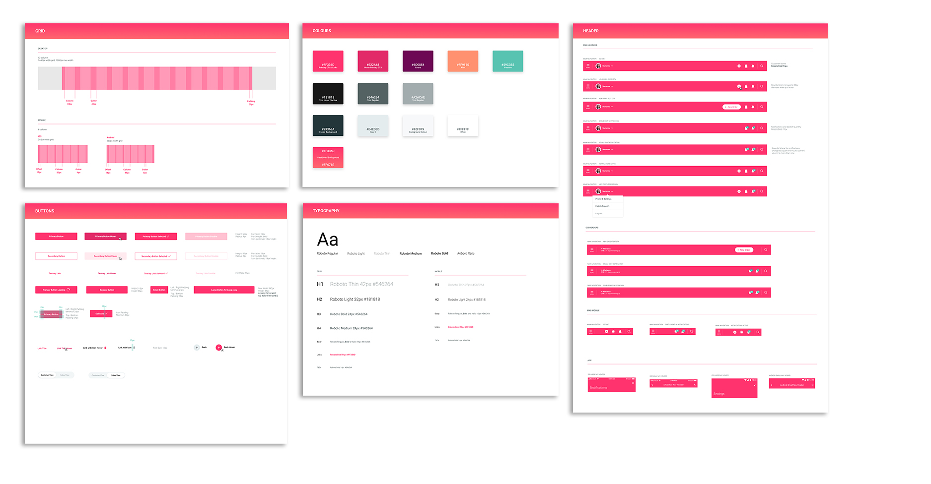
Avon design system component examples

🚀 Impact

This became the core for consistency across Avon's digital presence — a living style guide, updated with every new app or website release, built so multiple designers could take ownership and contribute new components without fragmenting the system.