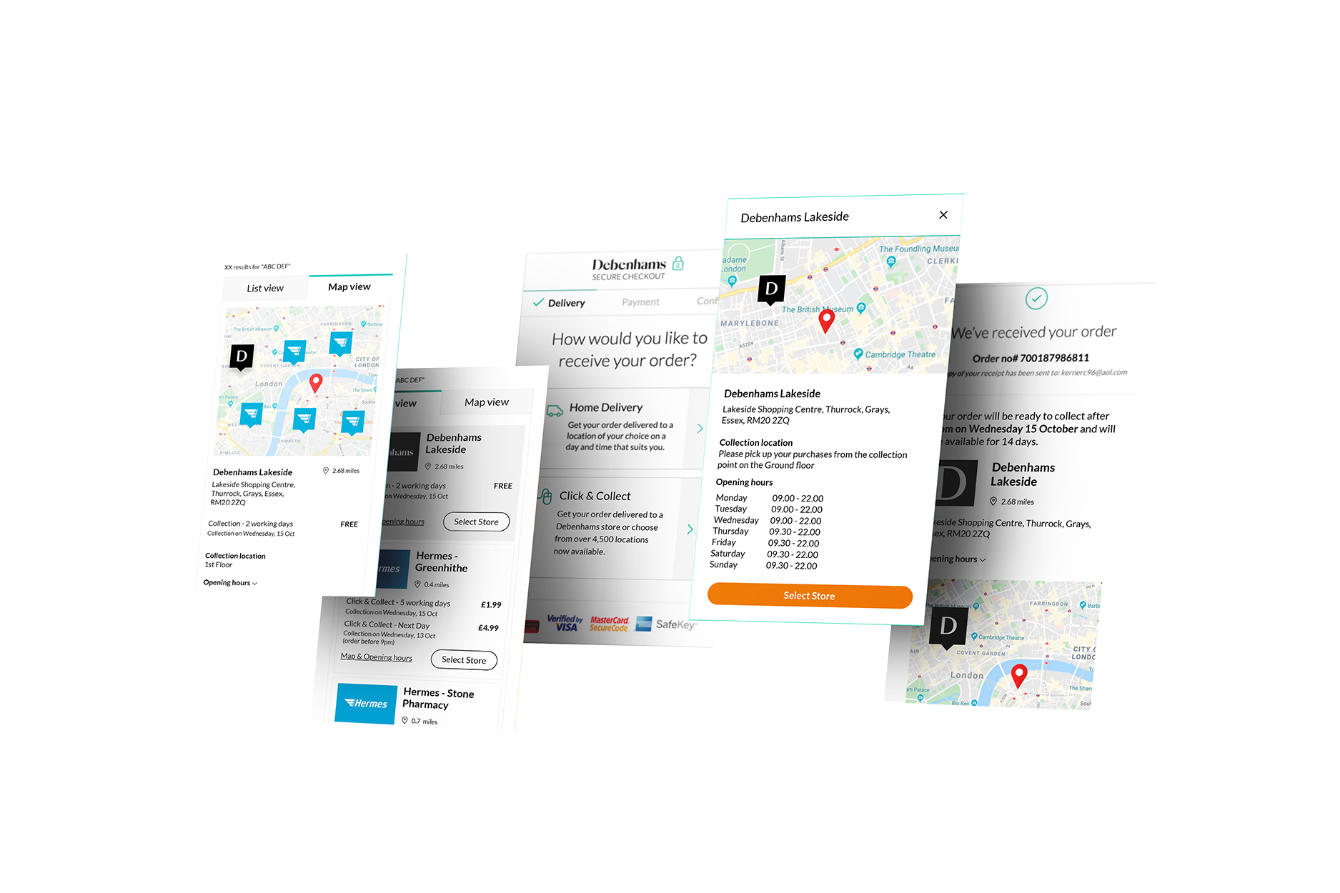
Click & Collect, or Home Delivery. Nothing in between.
One of my biggest projects for Debenhams was implementing a Pick Up & Drop Off system. Before this, customers only had two options: Click & Collect from stores, or Home Delivery. This new delivery option became critical in 2020 — Covid restrictions meant stores would need to close their doors, and customers needed more ways to receive orders while following social distancing rules.
Covid restrictions meant stores would need to close, and customers needed a Covid-safe way to send and receive orders.
I was involved in this project from the very beginning. Paired with the Senior UX Designer, we organised a workshop with stakeholders and the Head of Digital to align on the opportunity.
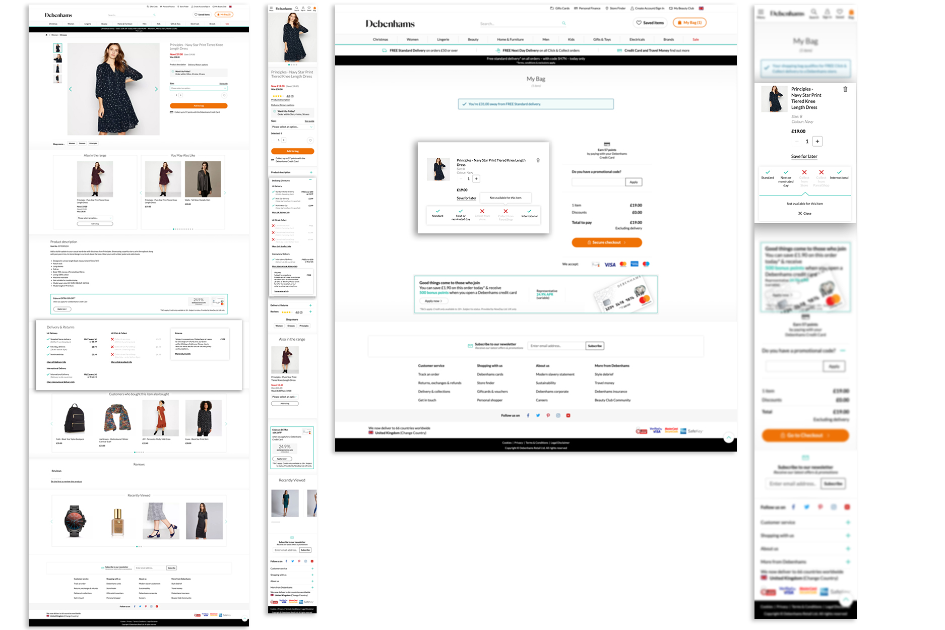
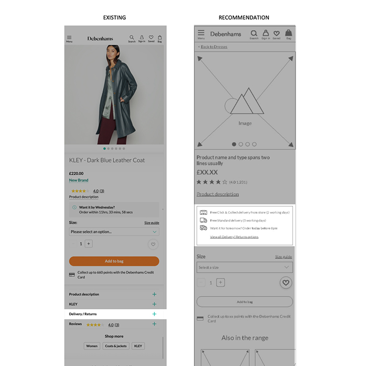
On the product page, "Delivery / Return" content could be segmented into a more digestible layout instead of one dense block.
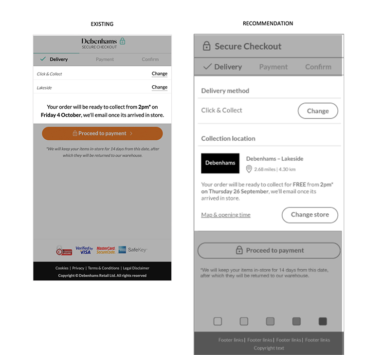
The delivery page only displayed the method and a collection location title. Customers needed to be fully aware of what they were choosing, not just shown a label.
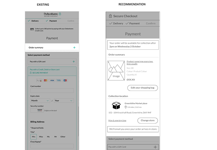
On the payment page, both the collection location and order summary were hidden inside an accordion. I recommended displaying both in full detail up front, so customers could take in everything at a glance rather than dig for it.
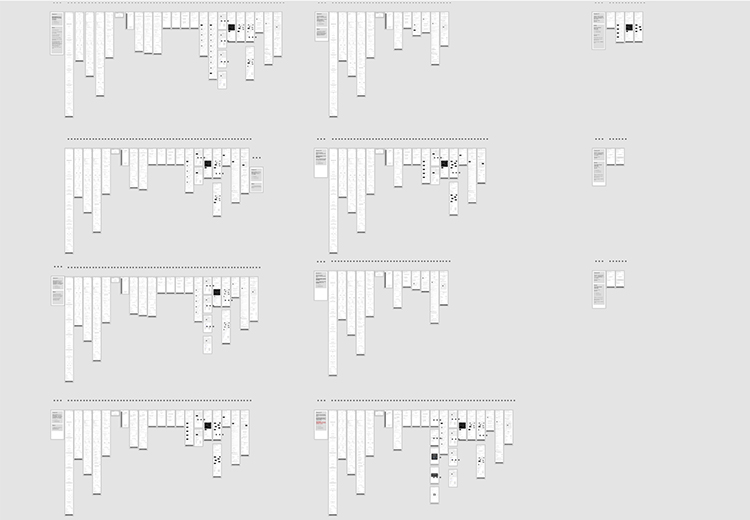
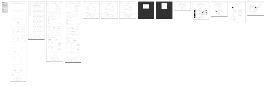
I created all desktop wireframes working closely with the Senior UX Designer, to translate the experience accurately from mobile to desktop.
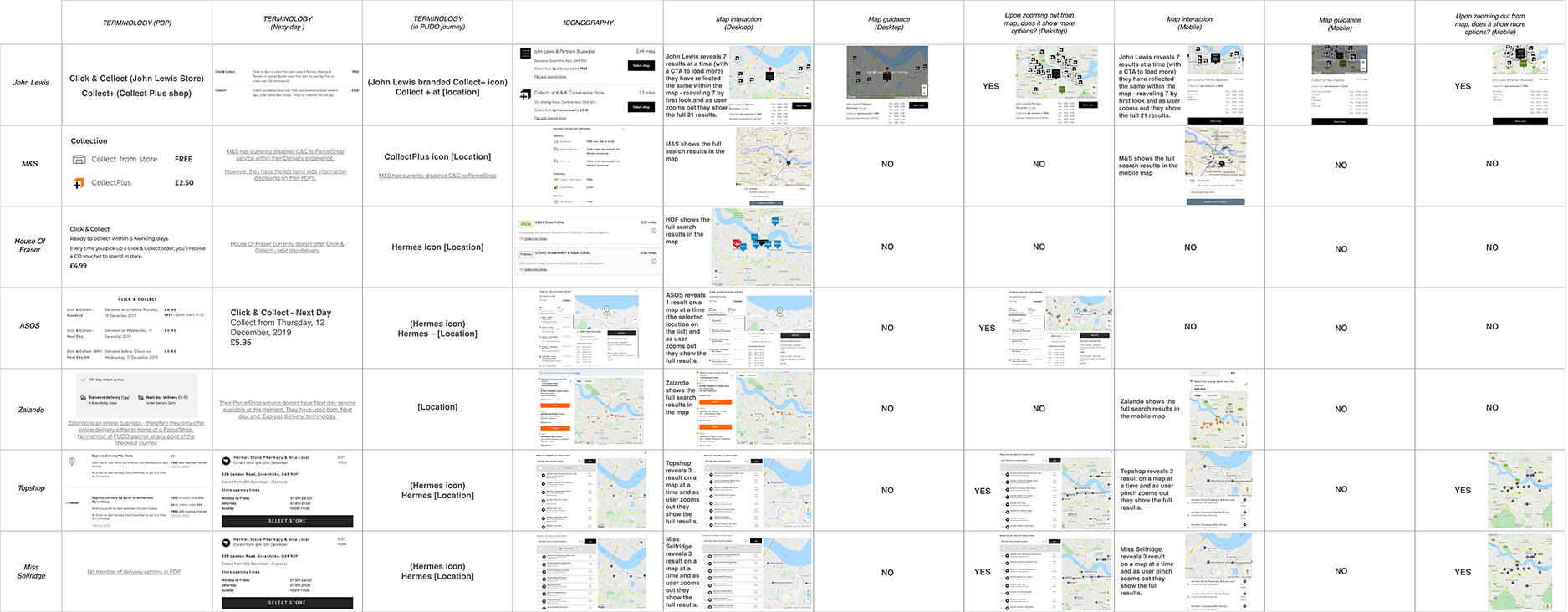
Before high-fidelity design, I built a table analysing naming conventions and how competitors displayed their map and list views — giving me a clear read on the range of approaches already out there before committing to a direction.
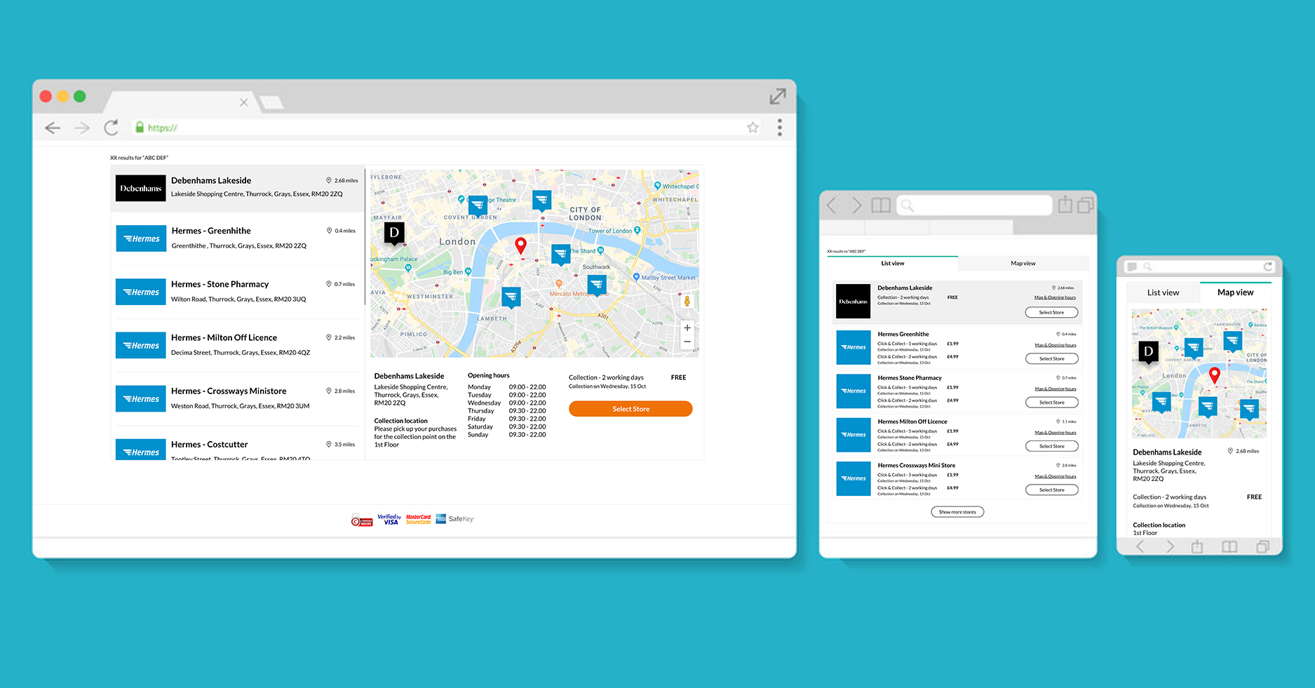
After discovery, I focused on high-fidelity screen designs for desktop, tablet, and mobile — recreating 10 scenarios so developers had concrete examples of how new components should behave across different states.
Visual improvements helped users digest delivery information on the Bag and Product Detail pages — shadows made the new sections stand out during design, though they weren't included in the final build.
Map and list views for Pick Up & Drop Off: on desktop, everything is visible at once; on mobile and tablet, customers navigate between tabs.
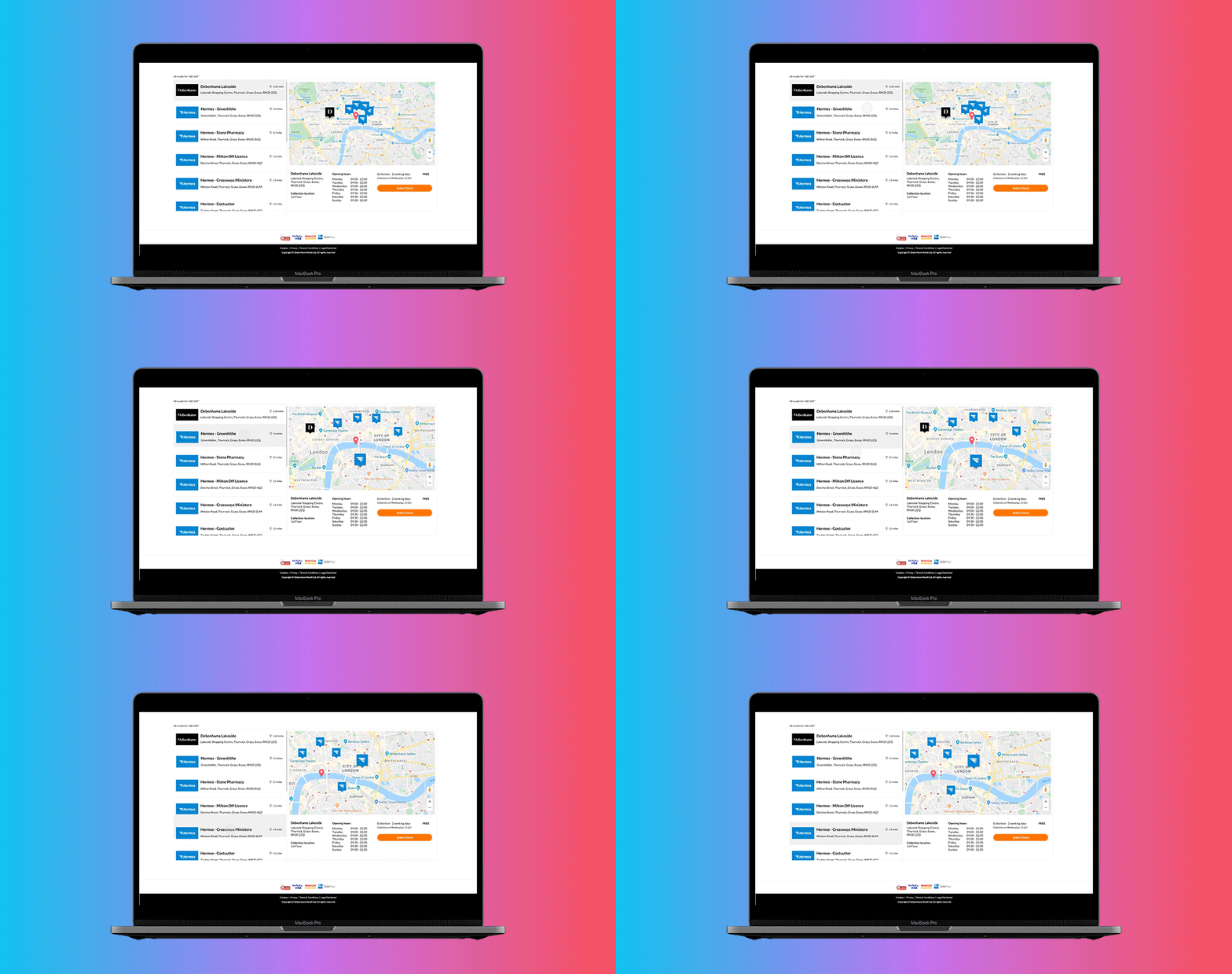
Building these features meant close, constant communication with development. At this stage, I used prototypes to make sure the map interaction behaved the way we'd designed it.
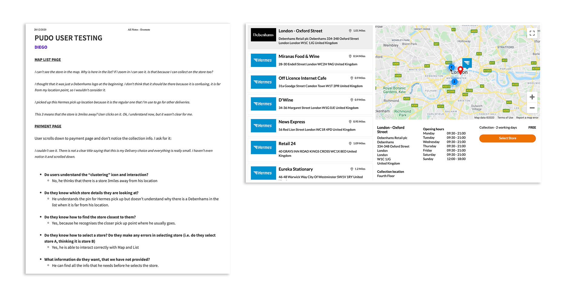
Before release, I had the full journey ready in staging. During final tuning, we introduced a new pin style to represent multiple pick-up locations when the map was zoomed out.
Releasing this experience was just the first step. I already had a backlog of improvements that weren't necessary for launch, and exposing the feature to real customers would give us accurate performance data to fine-tune the experience — the start of a new design iteration cycle, not the end of one.